

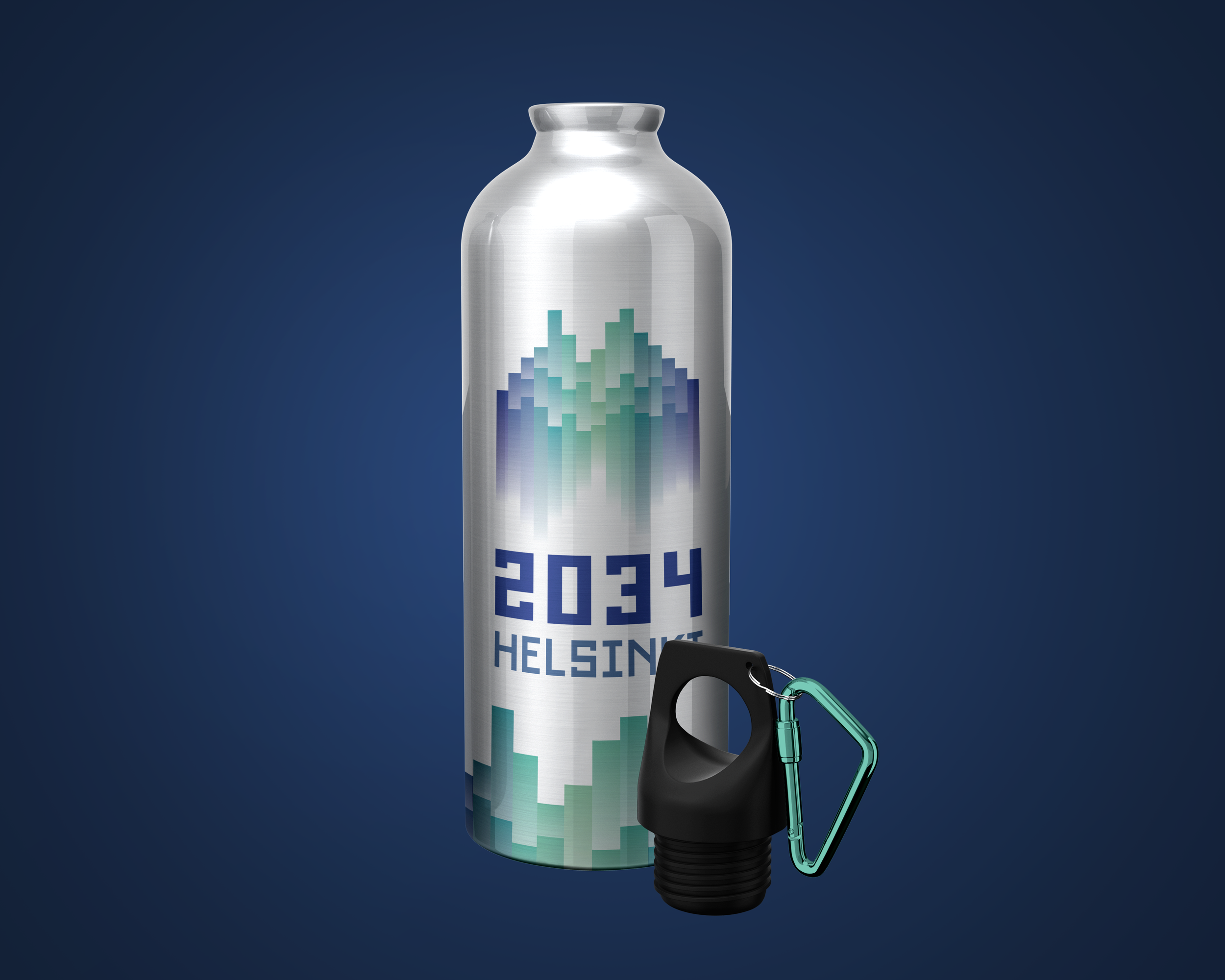
2034 Helsinki Olympics
This branding concept is a prediction of a potential winter Olympics taking place in Helsinki, Finland. The color scheme is based on Northern lights. The main iconography is based on the Jean Sibelius Monument.
Helsinki, Finland has had quite the history with the Olympics. They were supposed to host the summer games in 1940, but couldn’t because of World War II. You would think the city with the Olympic Stadium would be able to host the games once again, but it hasn’t since that summer. But what would it look like if Helsinki got a second chance? That is what I wanted to figure out with this project.
Research
I had to do a lot of research to figure out the culture of Helsinki. Having the Olympics take place in the winter instead of the summer made the most sense, since it is well known that it is where people can see the Northern Lights. It is also known for its creation of Angry Birds.

I also took note of different monuments and buildings around the city. One that stuck out to me was the Jean Sibelius Monument. The 27-foot-tall structure is made up of steel pipes, representing organ pipes. The intricate shape tied with the Northern Lights led me to create the first iteration of the logo.


Final Logo
The final logo simplifies the structure and utilizes a grid structure to align every element. The color palette is in reference to the Northern Lights. The custom typeface along the bottom of the primary logo is made to have the same width of each of the bars in the icon.


Compete: 2024
Institution: PennWest Edinboro
Art Director: Scott Gladd